just can’t decide…
i always figure out the colorways for different prints on the computer, and 98% of the time they come out exactly like i want them to when i actually print them. the first two hex sign skirt colorways came out just right…
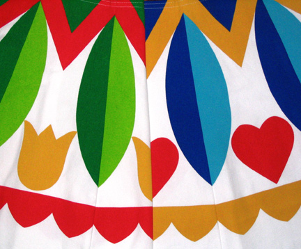
but i can’t decide which colorway of the star version i like.
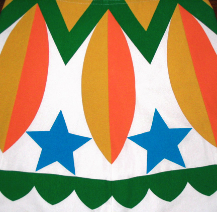
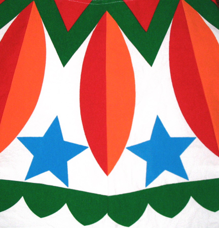
i printed the one with yellow first, then thought i might like it better with red. then i thought i liked it better with yellow. then i thought maybe i like mustard-y yellow alot more than most people. now i just don’t know. i’ve been staring at both of them for days. should i just flip a coin or will you decide for me? which one do you like better?
")
")
")
")
")
")
")
")
")
")
")
")
")
")
")
")
")
")
")
June 5th, 2009 at 2:58 pm
Hi Hannah, the first one with the mustard-yellow looks like a flat shape, whereas the red design creates the optical illusion of being raised in the center – the darker red on the left looks like a shadow and the brighter red on the right appears as the side where the light hits, thus creating a 3-dimensional effect. I would vote for the first one as my favourite. I also like the value contrast between the green border and the lighter warm colours on the first design.
June 5th, 2009 at 4:26 pm
Hooray! I can comment.
I like the red combo
June 5th, 2009 at 4:44 pm
Both are adorable, but I prefer the red one.
June 5th, 2009 at 8:04 pm
I like them both, but I like the mustard more.
June 5th, 2009 at 9:51 pm
Allow me to be the tie-breaker … it’s too hard to decide! They are fairly different and each in a good way. They are both fantastic.
June 5th, 2009 at 10:19 pm
Mustard, please!
June 6th, 2009 at 9:35 am
I like the yellow orange combo, it reminds me of a circus tent..the red is OK, but for some reason to me anyway, it just doesn’t pop like the first one..maybe too Christmassy looking??
June 6th, 2009 at 6:23 pm
red red red red red red
June 7th, 2009 at 12:36 am
I like the red!!!!